Oil pastels on Strathmore 400 toned gray - review
I get asked all the time about affordable paper recommendations to use with oil pastels so here I have one! I’m currently testing other papers as well but I’m going to start with this Strathmore 400 series toned gray sketchbook or pad.
This paper was suggested to me by one of my lovely patrons on Patreon a while ago so thank you!
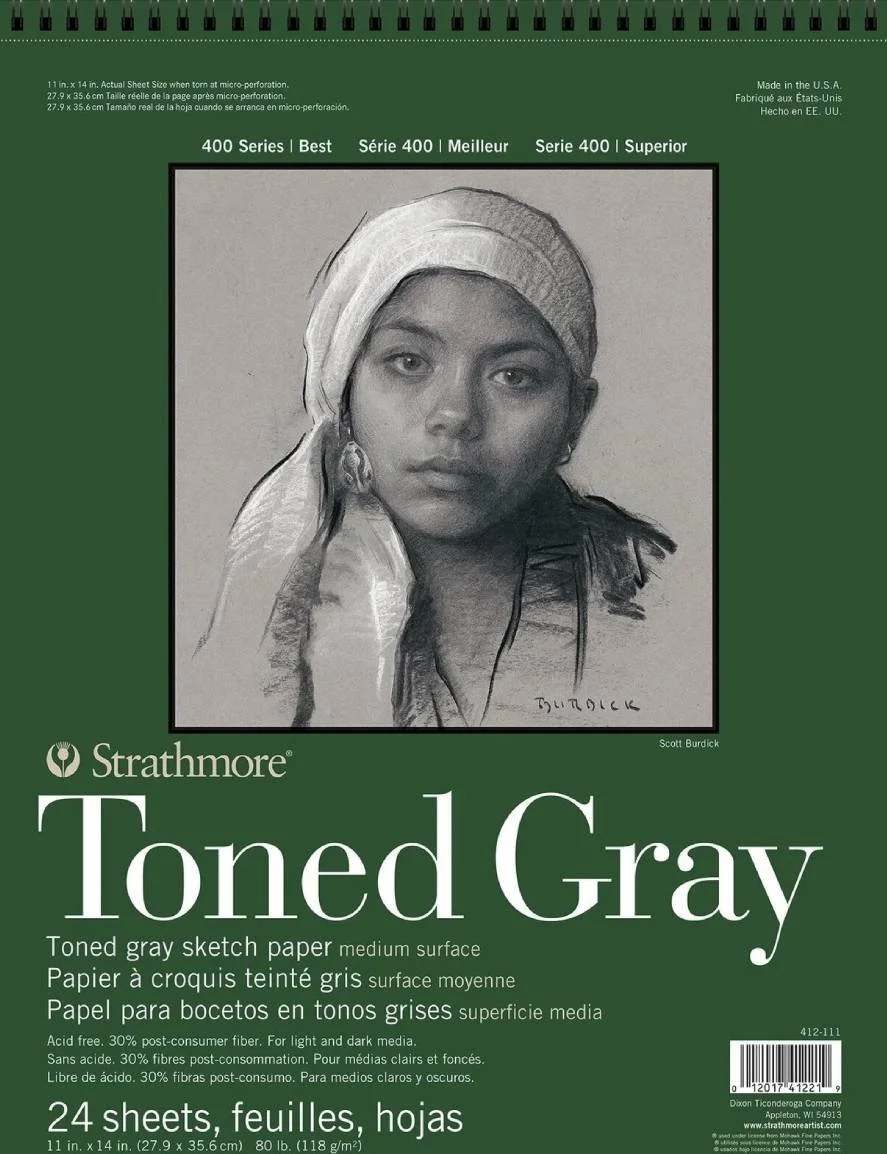
It’s available in tan and gray and I went with the gray one simply because I tend to prefer cool toned surfaces more but both looked nice. The pad or sketchbook I have measures 27,9 x 35,6 cm and has 24 pages but there’s at least a size smaller with twice as many pages.
The paper has a weight of 118g so it’s relatively thin but it still works great with oil pastels in my opinion. You just have to make sure you are holding the paper in place while you are blending so it doesn’t become crumpled.
I compare all the papers I try with my all time favourite Pastelmat because to me Pastelmat behaves perfectly and allows me to do whatever I want with my pastels, both soft pastels and oil pastels. I know it’s not a totally fair comparison because they are very different surfaces but I care about the performance and the feeling while painting or drawing and so I have to do it.
Until recently I had only used my Strathmore gray paper, other than a first sketch, to keep in there the swatches of my oil pastel to have them as a reference when I need to restock them. Then I decided to start simple with an easy cloudscape to get a feeling for the paper and see what I can do with it.
You can see my first impressions and the process of the painting in the video at the top of this post.
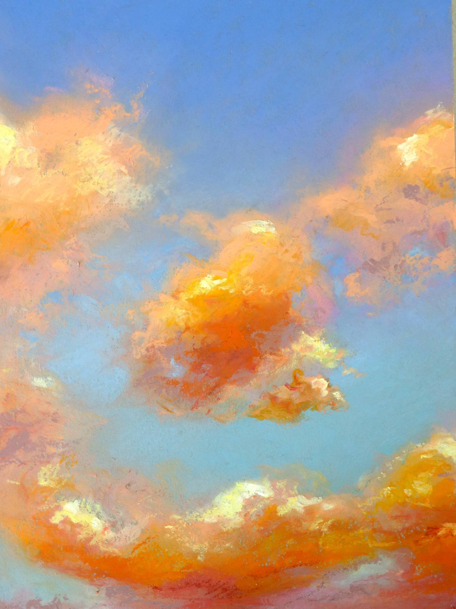
I believe it’s a nice paper for sketches and quick works. You can definitely layer on it but not as much as on Pastelmat or as easily. It’s not hard to do but it takes a bit more effort. You have to apply more pressure to draw and to blend and it won’t take as many layers but still enough for a good painting.
In the strathmore paper you can easily tell which colours are more translucent because you have to layer them more in order to get opaque coverage. The fact that the paper is gray doesn’t help with this. On pastelmat however, even if the sheet is of a darker colour, the pastels grab so well on to it that even when picking a semi-transparent colour it still shows pretty opaque. I’m making it sound quite bad but it really isn’t that big of a deal.
To prove that and to test it further I’ve painted a portrait on it as well:
For the background I used two very pale yellows that don’t have the best coverage but they still did a good job. I could have gotten it more even and opaque but I quite like it like this.
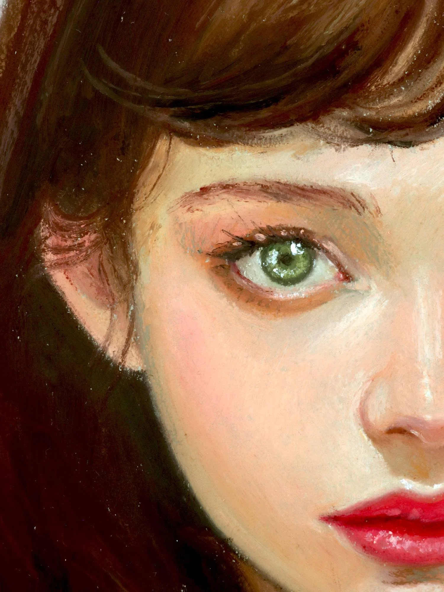
Like I mention in the video, I didn’t feel like I was fighting the paper while painting and it was fun to work on. With the portrait I chose to use paper stumps for all the blending and I think it works better with the Strathmore 400 paper than with my hands. I personally prefer to use a combination of the two: my hands to blend larger areas and paper stumps for small details and refining things.
Something I really liked about this paper is that you can very easily make fine likes and details just with an oil pastel stick. Check the eyebrows for example.
All in all it’s a good candidate for oil pastel works, it’s great as an sketchbook and I kinda wish I got the smaller size instead to use as an everyday sketchbook and for doodling. You can make very nice works in it without a problem but if I plan to spend a good amount of time on a painting to sell or a commission I’d use a more sturdy and thicker paper.
I hope it helps! Next paper to review will be Canson Mi-Teintes Velvet.
Have a nice day!